Aditya Mittal
Newspaper Feedback

Subject Articles Feedback: English (Ryden, Abdullah)
-
For home page:
-
lots of anmations (positive)
-
-
For English pages:
-
Layout:
-
add a menu bar inside the subject for easier navigatons
-
lots of animations (positive)
-
the navigation buttons at the end of each article need to be bigger (back to top, home, next page, etc)
-
replace "C.T." in the subject navigation bar with something else because it is unclear
-
good navigation for grades in article 2
-
good design for article 3
-
-
Content:
-
Some spelling mistakes in English article 2
-
Text spacing for the Incentive section of article 2 needs to be longer
-
spacing between titles for articles and text needs to be larger
-
The history of English in Intro page is good
-
good pics
-
VERY INFORMATIONAL
-
Likes how i summarized writing tips before going in depth (article 4)
-
-
Subject Articles Feedback: Math (Ryden, Abdullah)
-
For Math pages:
-
Layout:
-
FIX EMPTY SPACE IN INTRO PAGE
-
change "next subject button" to "back to intro" for better navigation
-
make images popup
-
-
Content:
-
good
-
history in intro section is good
-
add "courses" and "testimonies" page
-
-

Presentation Math Article Feedback
FEEDBACK NOTES:
-
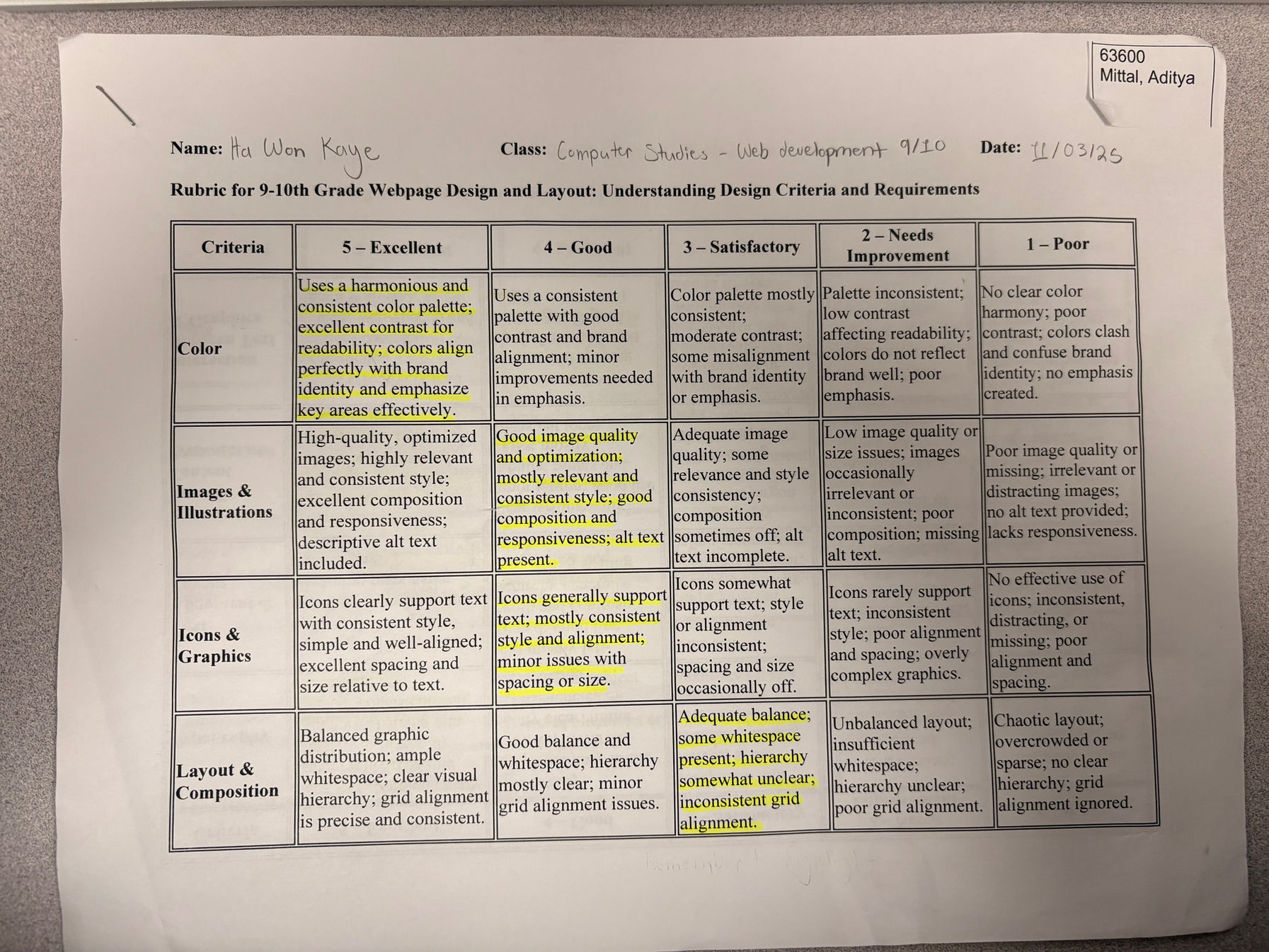
Add hues and variety in colour (I decided not to take this advice as i believe that the preexisting colours of my website add to my branding)
-
Add more images and highlight them instead of sidelining them (I believe that this is a great suggestion and added more images)
-
The text is too close to the edge (The text is a good distance away from the edges, but sometimes people zoom in too much, which brings the text very close to the edges. I do not feel the need to implement this suggestion.)
-
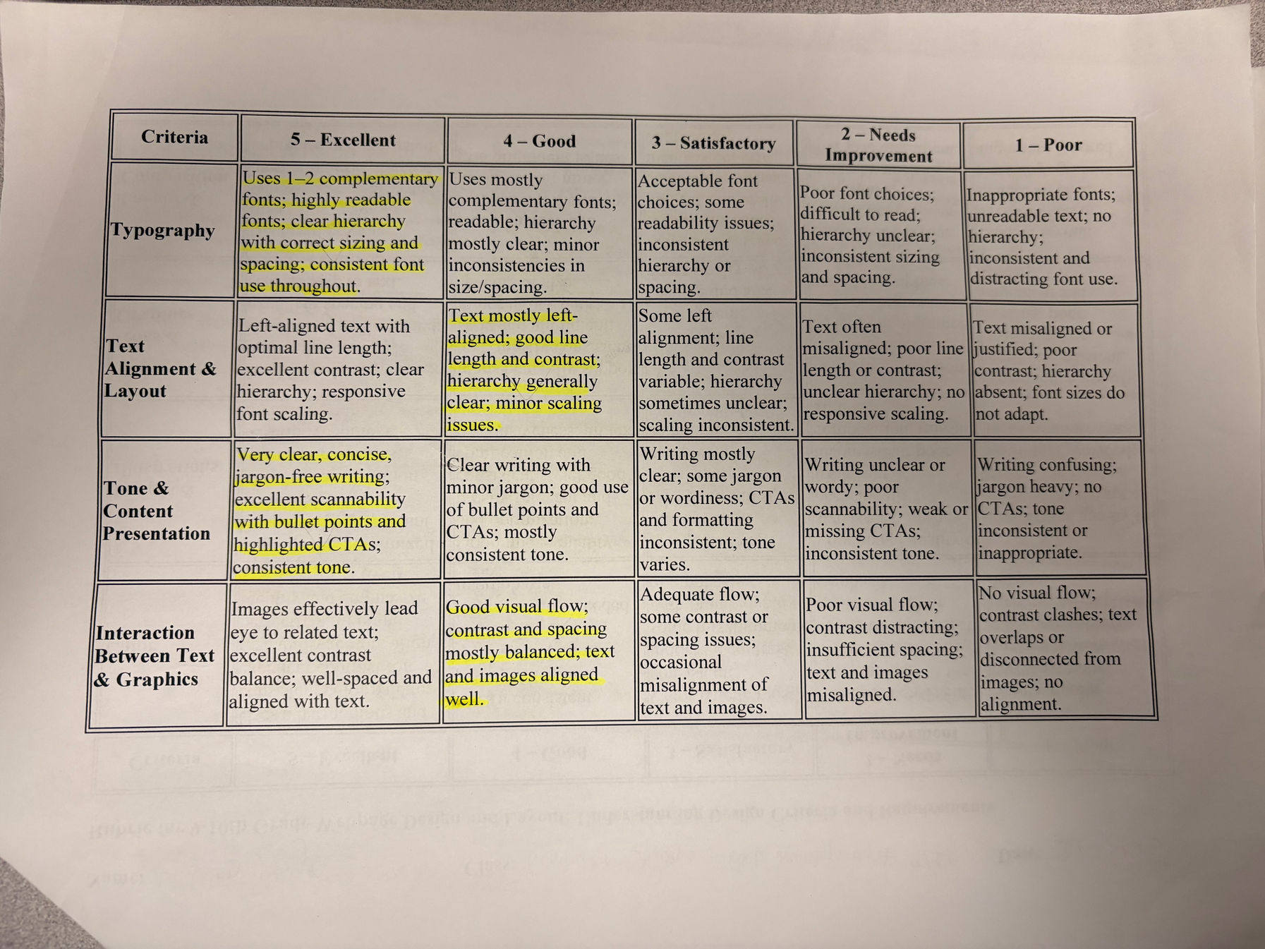
Some walls of text in certain articles (I decided to implement this suggestion in article 4, but believe that articles like article 1, 2, and 3 don't need it as the reader of my website won't be looking at all of the sections of the article, and the individual sections are already fairly short. ie: in Article 2, viewers of the website would simply navigate to their own grade instead of reading through all the grades.)
-
Could add spaces between text (I increased the spacing between the paragraphs in article 1 and 2)
-
Could add bullet points. (I reformatted the article 4 math problems into bullet points)
-
-
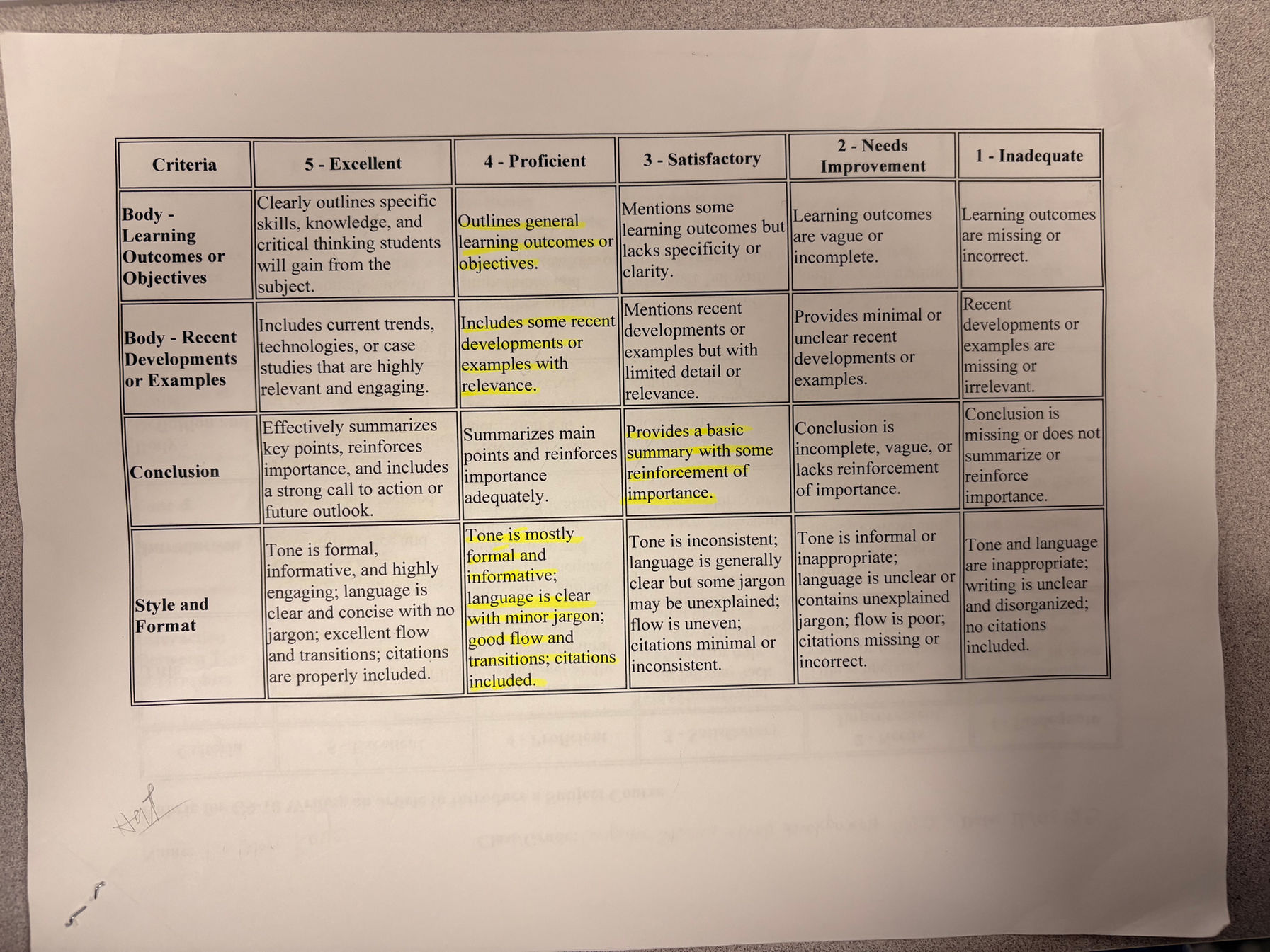
Add a dedicated section for recent dev (I decided not to take this suggestion as i have already integrated recent developments into the articles themselves, for example, in article 1 i detail how math developed in recent history and became what we learn at school today, and in article 2 i mentioned how students develop through math, all of which is supported by article 3, which has coutless reccent examples of people's experience with math. Creating a new, separate section for recent developments would be repetitive of the content already in my website.)


FEEDBACK NOTES:
-
Fix blurry pictures (I believe this is a great suggestion and have changed my images in the Languages Page)
-
Increase space between text boxes (I believe that this is a great suggestion and added more space)
-
Add more pictures to article two (Article two is centred on informing students about the courses offered and images do not contribute to that purpose. I do not feel the need to implement this suggestion.)
-
Add conclusion (I decided to implement this suggestion and add a conclusion that sums up all the website inside article 4)


